Matrix (printing): Difference between revisions
simplify heading / terminology |
→{{anchor|duplex}} Duplexing: more tight focus on the metal type applications |
||
| Line 19: | Line 19: | ||
== {{anchor|duplex}} Duplexing == |
== {{anchor|duplex}} Duplexing == |
||
[[File:Linotype matrix Casting Edge.jpg|thumb|Duplexed Linotype matrix for regular and bold styles.]] |
|||
A '''duplexed''' letter has the same width between its bold and light (non-bold) styles<ref>{{cite book|last=Durbeck|first=Robert|title=Output Hardcopy Devices|url=https://books.google.com/books?id=s329hWFOqPUC&pg=PA502|year=2012|publisher=Elsevier|isbn=978-0-323-14674-6|page=502|quote= the fitting of letter shapes to certain available widths, “duplexing”, or the placing of a light and bold character on the same width}}</ref> or between its italic and non-italic styles.<ref>{{cite book|last=Byers|first=Steve|title=The Electronic Type Catalog|url=https://books.google.com/books?id=rztUAAAAMAAJ|year=1991|publisher=Bantam Books|isbn=978-0-553-35446-1|page=11|quote= both designs had to measure the same width. This was called duplexing. If an italic was to be paired, or duplexed, with a roman, the italic was redrawn and refitted to the width of the roman.}}</ref> |
|||
The |
A '''duplexed''' matrix with two sites for casting letters was common on Linotype machines. By switching the position of the matrix two styles could be cast, which would have identical width.<ref>{{cite book|last=Durbeck|first=Robert|title=Output Hardcopy Devices|url=https://books.google.com/books?id=s329hWFOqPUC&pg=PA502|year=2012|publisher=Elsevier|isbn=978-0-323-14674-6|page=502|quote= the fitting of letter shapes to certain available widths, “duplexing”, or the placing of a light and bold character on the same width}}</ref><ref>{{cite book|last=Byers|first=Steve|title=The Electronic Type Catalog|url=https://books.google.com/books?id=rztUAAAAMAAJ|year=1991|publisher=Bantam Books|isbn=978-0-553-35446-1|page=11|quote= both designs had to measure the same width. This was called duplexing. If an italic was to be paired, or duplexed, with a roman, the italic was redrawn and refitted to the width of the roman.}}</ref><ref>{{cite web |title=duplexing, cross-rail duplexing |url=https://www.fonts.com/content/learning/fontology/glossary/d |website=Fonts.com |quote=A metal-type term referring to {{linktext|linecasting}} characters created to share matrices (the pieces of metal in which characters were cast) that consequently were designed to have exactly the same character widths (set widths). Typically, a roman typeface and its corresponding italic or a roman and a bold from the same typeface family might be designed to cross-rail duplex. When emulating typeface designs created for linecasting equipment, type designers need to be aware that the duplexing in these faces sometimes resulted in less than ideal spacing and/or character proportions in one or more of the typefaces that were duplexed.}}</ref> A common combination was regular and italic for text faces, or regular and bold as on [[Metro (typeface)|Metro]], but Linotype also offered more unusual combinations, such as a serif text face duplexed with a bold sans-serif for emphasis.<ref name="Handbuch der Schriftarten">{{cite book|title=Handbuch der Schriftarten|date=1926|pages=181–218|publisher=Seemann|location=Leipzig|p=293|url=http://www.klingspor-museum.de/Handbuch-der-Schriftarten.html|accessdate=30 June 2017}}</ref> |
||
All [[monospaced font]]s are inherently duplexed. |
All [[monospaced font]]s are inherently duplexed. |
||
Revision as of 00:51, 14 August 2020

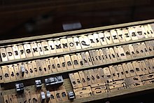
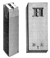
In the manufacture of metal type used in letterpress printing, a matrix (from the Latin meaning womb or a female breeding animal) is the mould used to cast a letter, known as a sort.[4] Matrices for printing types were made of copper.[5]
However, in printmaking the matrix is whatever is used, with ink, to hold the image that makes up the print, whether a plate in etching and engraving or a woodblock in woodcut.
Description
In letterpress or "cold metal" typesetting, used from the beginning of printing to the late nineteenth century, the matrix of one letter is inserted into the bottom of a hand mould, the mould is locked and molten type metal is poured into a straight-sided vertical cavity above the matrix. When the metal has cooled and solidified the mould is unlocked and the newly cast metal sort is removed. The matrix can then be reused to produce more copies of the sort.[6] The sorts could then be cleaned up and sent to the printer. Matrices could be used for many castings of type.

In the hot metal typesetting systems of the later years of metal type printing, from the late nineteenth century onwards, new type is cast for each job under the control of a keyboard. The matrix or mats for a complete font are loaded into a matrix-case and inserted into a casting machine, which casts the required sorts for a page composition automatically, often from a paper reel.

The standard method to make a matrix was to drive a steel punch in the shape of the type to be made into soft copper.[9] The matrix would then be cleaned up and cut down to the width of the letter to be cast.
Large typefaces, or wide designs such as emblems or medallions, were never very easily produced by punching since it was hard to drive large punches evenly. Early alternative methods used included printing from woodblocks, 'dabbing', where wood-blocks were punched into metal softened by heating, or carefully casting type or matrices in moulds made of softer materials than copper such as sand, clay, or punched lead.[10][11][12][13] One solution to the problem in the early nineteenth century was William Caslon IV's riveted "Sanspareil" matrices formed by cut-out from layered sheets. The problem was ultimately solved in the mid-nineteenth century by new technologies, electrotyping and pantograph engraving, the latter both for wood type and then for matrices.
From the nineteenth century additional technologies arrived to make matrices. The first was electrotyping from the 1840s, which forms a copper matrix around a pattern letter by electrodeposition of copper.[a] The advantage of electrotyping was that the pattern letter did not have to be out of hard steel, so it could be cut in soft type metal much faster than a punch could, and this allowed an explosion in the number of display typefaces available.[15] It also allowed printers to form matrices for types for which they did not have matrices, or duplicate matrices when they had no punches, and accordingly was less honourably used to pirate typefaces from other foundries.[15] The matrices formed were sometimes fragile and the technology was most commonly used for larger and more esoteric display typefaces.[15] An additional technology from the 1880s was the direct engraving of punches (or, especially for larger fonts, matrices) using a pantograph cutting machine, controlled by replicating hand movements at a smaller size. This allowed rapid production of punches for issuing the same design in many sizes.
Duplexing

A duplexed matrix with two sites for casting letters was common on Linotype machines. By switching the position of the matrix two styles could be cast, which would have identical width.[16][17][18] A common combination was regular and italic for text faces, or regular and bold as on Metro, but Linotype also offered more unusual combinations, such as a serif text face duplexed with a bold sans-serif for emphasis.[19]
All monospaced fonts are inherently duplexed.
See also
References
- ^ "Jannon". French Ministry of Culture.
- ^ "Monotype Garamond". Fonts.com. Monotype. Retrieved 4 July 2015.
- ^ "Garamond". Microsoft. Retrieved 4 July 2015.
- ^ Man, John (2002). The Gutenberg Revolution: the story of a genius that changed the world. London: Headline. ISBN 0-7472-4504-5. [page needed]
- ^ Theodore Low De Vinne (1899). The Practice of Typography: A Treatise on the Processes of Type-making, the Point System, the Names, Sizes, Styles, and Prices of Plain Printing Types. Century Company. pp. 9–36.
- ^ Meggs, Philip B. A History of Graphic Design. John Wiley & Sons, Inc. 1998. (pp 58–69) ISBN 0-471-29198-6
- ^ "Monotype matrices and moulds in the making" (PDF). Monotype Recorder. 40 (3). 1956.
{{cite journal}}: Cite has empty unknown parameter:|1=(help) - ^ Morison, Stanley. "Printing the Times". Eye. Retrieved 28 July 2015.
- ^ Tracy, Walter. Letters of Credit. pp. 32–40.
- ^ Mosley, James. "Big brass matrices: a mystery resolved?". Type Foundry (blog). Retrieved 5 October 2017.
- ^ Mosley, James. "Big brass matrices again: the Enschedé 'Chalcographia' type". Type Foundry (blog). Retrieved 5 October 2017.
- ^ Mosley, James. "Dabbing, abklatschen, clichage..." Type Foundry (blog). Retrieved 5 October 2017.
- ^ "Ornamented types: a prospectus" (PDF). imimprimit. Archived from the original (PDF) on 22 December 2015. Retrieved 12 December 2015.
- ^ Howes, Justin (2000). "Caslon's punches and matrices". Matrix. 20: 1–7.
- ^ a b c MacMillan, David. "Patrix Cutting and Matrix Electroforming: A Survey of the Data". Circuitous Root. Retrieved 6 October 2017.
- ^ Durbeck, Robert (2012). Output Hardcopy Devices. Elsevier. p. 502. ISBN 978-0-323-14674-6.
the fitting of letter shapes to certain available widths, "duplexing", or the placing of a light and bold character on the same width
- ^ Byers, Steve (1991). The Electronic Type Catalog. Bantam Books. p. 11. ISBN 978-0-553-35446-1.
both designs had to measure the same width. This was called duplexing. If an italic was to be paired, or duplexed, with a roman, the italic was redrawn and refitted to the width of the roman.
- ^ "duplexing, cross-rail duplexing". Fonts.com.
A metal-type term referring to linecasting characters created to share matrices (the pieces of metal in which characters were cast) that consequently were designed to have exactly the same character widths (set widths). Typically, a roman typeface and its corresponding italic or a roman and a bold from the same typeface family might be designed to cross-rail duplex. When emulating typeface designs created for linecasting equipment, type designers need to be aware that the duplexing in these faces sometimes resulted in less than ideal spacing and/or character proportions in one or more of the typefaces that were duplexed.
- ^ Handbuch der Schriftarten. Leipzig: Seemann. 1926. p. 293. Retrieved 30 June 2017.
{{cite book}}: More than one of|pages=and|p=specified (help)
- ^ One problem with electrotyping is that the newly formed letter is slightly smaller than the original letter - a shrinkage of about 0.0038%. While not a great problem for a single electrotyping, the effect could multiply in letters repeatedly copied. According to Justin Howes, sometimes type to be electrotyped was squashed slightly in a press or filed down to compensate before it was duplicated.[14]

